WAUKEE HIGH SCHOOL GRAPHIC DESIGN
This blog shows various projects and work of students.
Students can also find assignments on this blog and comment on other students work.

"The principle goal of education is to create men and women who are capable of doing new things, not simply repeating what other generations have done - men and women who are creative, inventive and discovers" -Piaget


Sierra's CD Design


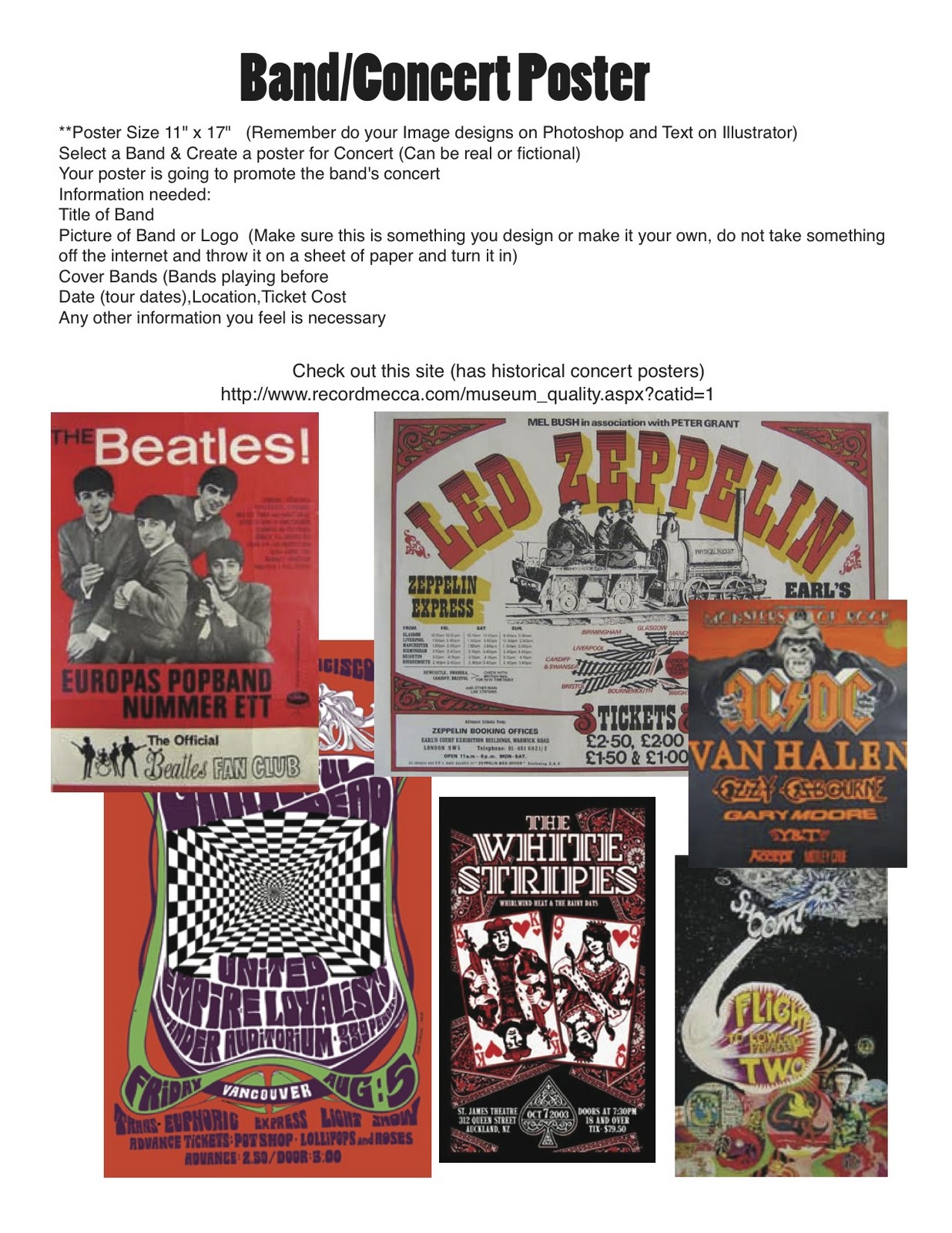
 For the cover, I the name "Drizzy Drake" and typed it in a few times, then i copy and pasted it onto the page and made rows of it. I changed the color and bolded another letter at the beginning of each row that went down. Then, I put a picture of Drake on the right side and changed the opacity to 50% so you could see the words over the picture. Didn't take too long and it wasn't really that hard (:


On the front cover I used an image of the elephant with his trainers, and the fire blower people and put them together, using the fire as a background. The ring of stars was taken off of Google and used as a border, with the red circle adding more color to the black background of the CD case. Font for "Circus" uses big top stripes to make it more interesting.

CD Design


On the front cover I uploaded the picture of the fireworks. Then I went into the filters and applied 2 different filters. Also I sharpened the edges, as well as adding a few more colors. I made some of the colors pop by using the brush and adding the same color along the streaks of the firework. After I applied my filters is when I really got the colors to pop in the picture! :)
The front cover (which is the top right picture) is awesome. I started our with the picture of the mountain and added a cutout filter to it in photoshop. Then I found another picture of a man on a beach with his arms raised and used the lasso tool and cut out the man and applied the cutout filter to it also. Then I transferred them over to Adobe illustrator. I added an arc to illustrator and typed "DESTINATION" following the arcs path and then typed the word "THE" to the right of it. I added a chisel effect to the lettering to make it look more rigid. Then I typed out the work "JOURNY" and added the silver image effect to it to create a cooler look to it. Then I went through and added the blue color to the inside of all the font and made the outline of the chisel white.


Waukee Swim Logo

Designed by Phil Kruzan (I probably messed up his spelling)  he designed this last spring of 2010. It is now used by the swimming team.